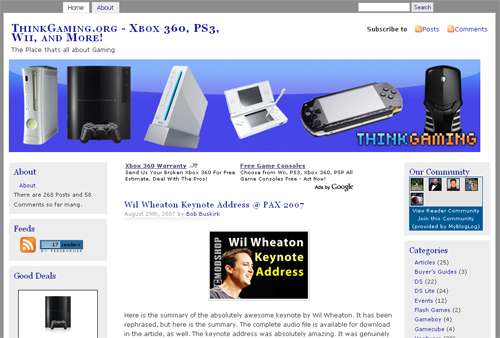
If you head on over to ThinkGaming you can see it has a new look. When I first switched ThinkGaming over to wordpress I used the same layout I was using for ThinkComputers, with different logos of course. This layout works very well on ThinkComputers, but I really did not like how it looked on ThinkGaming. ThinkGaming is more of a blog and ThinkComputers publishes full reviews so they are a bit different. I really did not like how the posts were looking on the layout and I felt like it needed a new look. So after looking through a bunch of wordpress themes I picked mistylook, which is also used on this blog.
Mistylook originally only has 2 columns, but as you can see on this blog and ThinkGaming I made it into a 3 column layout. ThinkGaming is different than this blog though, I moved one of the columns over to the far left of the layout. I really like this look and think it turned out well. I also made the top graphic myself. I’m no expert at Photoshop, but I think it came out alright. If anyone wants to make a better one you are more than happy to. I also added a few more features like the MyBlogLog reader community, and recent comments. I’m looking to add more features to the site so if anyone knows of any good wordpress plugins please let me know, thanks!
